06 · Case study · 2024
AXA: Mobile Comparison Matrix
Exploring better comparison patterns for insurance packages on mobile
- Role
- Senior UX/UI Designer
- Timeline
- 2024
- Industry
- Insurance · Financial Services · Mobile UX
A product-comparison exploration for AXA, focused on helping users understand differences between formulas when limited mobile screen space makes side-by-side comparison difficult.
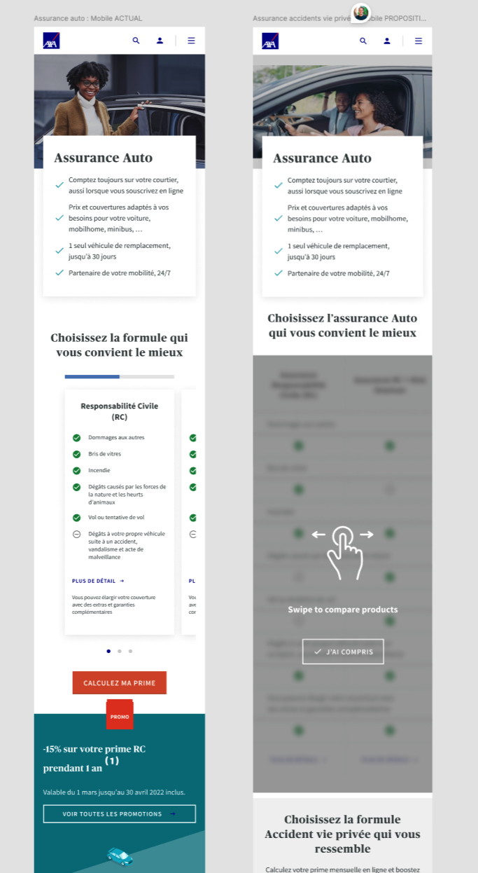
Insurance products often come with packs, options and formulas that need a clear helicopter view. Product cards can work on desktop, but mobile comparison is much harder because users cannot easily scan multiple options at once.
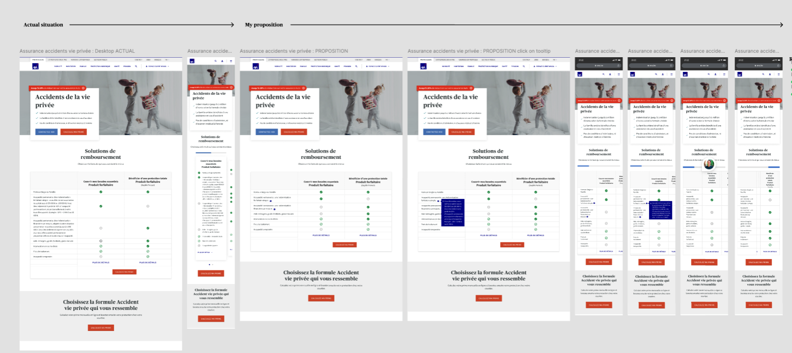
The project explored a swipable comparison matrix intended to make formula differences easier to inspect on mobile. A running Figma prototype was designed and prepared for validation. User testing then showed that users still preferred the existing card-based version, which made the first proposal a useful but incomplete answer rather than a final pattern.
The user-test results redirected the design toward a second iteration. The work became a strong example of evidence-led design: research and analysis shaped the proposal, but user preference overruled the initial solution and informed a V2 planned for further testing.